Enhancing UX for Silver Surfers: A Kinder Design Approach
Leeza Mundaden /
A friend’s mom called him frantically – everything she had ordered on Amazon had been shipped to her previous home; they had recently moved. It’s no big deal, right? We’ve all ordered stuff to the wrong address at some point and know how to resolve this. Now picture a lady well into her 70s, grappling with e-commerce on a 5th gen smart phone, and you’ll see why this event seemed catastrophic.
This reminded me of countless SOS calls I have received from my parents. Have you caught yourself saying stuff like…“ Top right of your screen, near that person’s outline, next to the three stacked lines”… or “Has something turned red? If it’s not allowing you to proceed you’ve done something wrong… again.”? I feel so terrible even as I type. I’m guilty of all this and more. Being a UX designer, I am supposed to be wearing empathy as a cape at all times. And yet, I find myself getting annoyed, using tech jargon as if it were always part of the English language, and worst of all – finishing the task myself because no matter what they say about teaching a man to fish, it’s definitely easier to just get him some fish.
Being an older millennial with senior parents means watching a superhero parent repeatedly saying ‘I can’t handle any of this, I can do nothing’ as they struggle with technology.
The sympathetic side of me finds this heartbreaking, the empathetic side of me acknowledges that design is guilty of disservice to this part of the population, and the daughter in me is unfortunately mostly irritated.
One day out of the blue my dad sent me a ‘WhatsApp forward’ (of course) on the lines of “I taught you how to use a spoon and you have no patience for me today.” The only thing worse than sending your kids on a guilt trip is being right while you’re at it.
The sad truth
In all the UX design and redesign projects that I have worked on, I am yet to hear a client say, “We must also think of seniors who use our app”. Traditional target demographics rarely extend beyond middle-aged adults, leaving seniors marginalized in the digital realm. The design of almost all apps enables adult children to use them on behalf of their parents from anywhere in the world, yet very few are accessible and user-friendly enough for senior parents to use themselves. Why are only entertainment and social messaging apps working for them? Is it because these apps were designed for the lowest common denominator and by a stroke of luck, seniors got included?
While accessibility serves the specially abled as well the elders, it has more to do with readable fonts, legible contrasts, screen reader friendly products etc. – all of these are most definitely crucial. There is however another cog in the wheel of inaccessible sites for seniors and this has nothing to do with the UI. Is the user experience senior friendly?
The answer is no.
Why bother? Let’s look at some numbers
People born between 1946 – 1964 are called the baby Boomers, also digital immigrants. They’re the folk in the age group of roughly 60-80 today. In a population of over 1.4 billion, close to 16 crores are above 60 – that’s around 11%. That’s around 8 Mumbai cities. And this number will only increase.
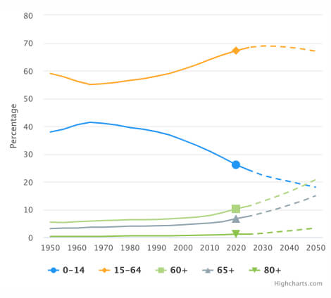
Proportion of the total population by broad age group, 1950 – 2050
If you think we don’t need to consider the elderly since they don’t use smartphones as much or they probably have someone to help them out, then check out these stats. A YouGov report indicates that 67% of India’s urban online population can’t do without their smartphones. And guess who showed the highest reliance? Seniors aged 60-65 were at 79%, compared to 63% of those aged 20-25. Based on another article published in 2018 by the National Library of Medicine – a US government website, around 15 million (1.5 crores) elderly in India live all alone.
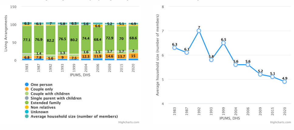
Household living arrangements of people aged 65+
How can design be more considerate?
I think a lot about what technology means to seniors, how they interact with it, and how it interacts with them. Above everything else, I sense resistance, fear, and surrender to just how complex it all is and how you cannot teach an old dog new tricks. As the aging population of the world increases, it makes no sense to keep them out.
Unlike WhatsApp and YouTube which is for EVERYONE, having to design for seniors might mean having to create a different interface like you would if you had to design for children. Think YouTube kids.
To ensure that design carefully considers inhibitions and apprehensions of this special demographic, I would like to introduce the KINDER framework.
K – Key Task Only
Simplify interfaces by focusing on essential functionalities, minimizing complexity, and eliminating unnecessary features. Seniors go to WhatsApp to chat and send forwards; PayTM to pay. Almost everything else on the screen and bottom navigation add cognitive load and goes untouched for fear of the unknown.
I – Ignorance-Proof UI
Implement intuitive design principles, avoiding hidden gestures and convoluted navigation pathways. Actions concealed inside right and left swipes, long presses and double taps don’t come naturally to this generation. They might tap multiple times out of impatience only to realise that some double-tapping gesture has unintentionally gotten recorded.
N – No-Nonsense Navigation
Prioritize straightforward navigation systems to ensure ease of use and accessibility for seniors. Forward, back, flat menu structures and clear location cues – that’s all they need. Don’t intimidate them with long winded journeys which leave them feeling stuck and lost.
D – Diverse Accessibility
Incorporate a range of accessibility options such as font size adjustments, high contrast, and audio feedback to accommodate varying abilities. Ensure that these choices are available upfront and not inside some profile setting which isn’t legible enough to spot in the first place.
E – Expanded over Expandable
Emphasize expanded information over expandable content, providing clear and concise communication without making the user search for hidden information. Putting information inside collapsed accordions or kebabs are not easily discoverable for seniors. The inherent fear of tapping on unknown icons will ensure that they can’t find what’s concealed.
R – Refined Communication Style
Utilize clear, respectful, and formal language reminiscent of official documents, fostering familiarity and comfort for senior users. It might be cute to use conversational tones but remember that this is the generation that expects digital to be a replica of the physical except for the medium, so all the additional copy will only slow them down more.
My (slightly outlandish) proposal
There are product categories that instantly enhance our quality of life like cab services, e-commerce, food delivery, medicine delivery, UPI payments, basic banking etc. What if we designed 2 versions of such products – the regular version and a no-frills version with the bare minimum. When logging in the user can pick which they want to access and obviously can switch at any time.
We already design for mobile first to find the most critical elements and features that will occupy this limited screen size. This version would be scaled down one step further with even fewer features. Marketing and sales teams will need to be kept strictly away from usurping any part of the real estate on the latter. Use the KINDER framework here.
Despite the inherent challenges, there are immense opportunities to leverage technology for the benefit of seniors. Yes, it will require additional resources and investment, but the long-term benefits outweigh the initial costs. In an ideal world, businesses could take this up as their contribution to a social cause.
Final thoughts
We cannot keep designing only for the tech savvy audience in the hope that they will teach their parents and the widowed neighbour how to pay online, order food for them when the cook doesn’t show up, or book them a cab when the rickshaws are on strike?
We may not encounter this problem 20-30 years from now because the boomers would have passed into the afterlife. But until then I believe we owe it to them to make design simpler and more patient; thoughtful and tailor made. Without that you are leaving out a sizeable chunk of the population. One that is feeling frustrated, embarrassed, and too shy to ask. After all, they did teach us how to use a spoon. It’s the least we can do.
References
- https://www.ncbi.nlm.nih.gov/pmc/articles/PMC6199841/#:~:text=According%20to%20the%20last%20census,prominent%20position%20in%20the%20family.
- https://www.population-trends-asiapacific.org/data/IND
- https://www.worldometers.info/demographics/india-demographics/#pop