Diff’rent Strokes (for different screens)
Muneesh Kapoor /
In today’s world, digital content is consumed through every channel possible; whether it’s a desktop, tablet, mobile, smartwatch, or even personal assistants. Designers and developers need to collaborate to create designs which would work on all these platforms seamlessly.
Firstly, any UI designer should be aware of the difference between fixed layout, fluid layout, adaptive layout and responsive layout. If you aren’t, I would advise you to read Harshal’s article on this subject. He is our resident unicorn and has written about adopting the right strategy to designing for multiple screen sizes.
At the start of any web UI designing process, the designer should be aware of what platform the content is catering to. The designer and developer should then decide on the layout and the designer should design accordingly.
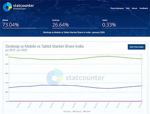
One approach that we follow at ZEUX is the mobile-first approach where we start the product design from the mobile end, which has more restrictions, then expand its features to create a desktop version. There are a couple of reasons. Firstly, mobile devices are now a central part of our everyday life. If you look at the market share of all 3 devices in India over the period of 2018-2019, there are 3 times more mobiles than desktops and laptops.
Secondly, the real estate on a smartphone is much smaller than a desktop. The mobile-first approach works in this case as it’s a tenet of progressive enhancement. According to Wikipedia, ‘Progressive enhancement is a strategy for web design that emphasizes core webpage content first. This strategy then progressively adds more nuanced and technically rigorous layers of presentation and features on top of the content as the end-user’s browser/internet connection allow.’ Following this approach would organically lead to a design that is more content-focused, and therefore user-focused.
When we are talking about mobile-first approach and responsive design development, we must mention Bootstrap. Bootstrap is a free and open-source CSS framework directed at responsive, mobile-first front-end web development. It contains CSS- and (optionally) JavaScript-based design templates for typography, forms, buttons, navigation and other interface components. My suggestion would be to just go to their website and look at their components even if you don’t want to learn bootstrap. It will give you a basic understanding of the grid system and usage of UI components on the web.
References:
- https://medium.com/@Vincentxia77/what-is-mobile-first-design-why-its-important-how-to-make-it-7d3cf2e29d00
- https://www.uxpin.com/studio/blog/a-hands-on-guide-to-mobile-first-design/
- https://en.wikipedia.org/wiki/Progressive_enhancement
- https://en.wikipedia.org/wiki/Bootstrap_(front-end_framework)
- https://gs.statcounter.com/platform-market-share/desktop-mobile-tablet/india/#monthly-201901-202001