The Dark Side of UX
Sugesh Sugathan /
When we think of the word bamboozle, we imagine a scheming con man that has strategically laid out a plan to fleece an unaware, unassuming dude of his belongings. What about a sagacious-looking monk in a saffron robe handing you a holographic photo of the Buddha, only to realize that once the photo has exchanged hands, you owe the monk two dollars. who can’t or won’t speak English and also won’t take back the photo. (That’s right! This really happened to me.) As I walked away from this situation partly shocked and a few dollars poorer, I contemplated, “Will I dismiss or avoid anybody who shows up in a similar attire and tries to talk to me? What if the next monk genuinely needs help? How could I tell whether he is being genuine? Maybe, I should avoid taking that street to work.” I realized there has been a loss on both sides. My loss was mainly monetary and a bruised ego. But, that monk lost my blind faith in the visual image of monks in general. I know, I’m generalizing but you cannot blame me for being cautious the next time I notice a smiling monk approaching me.
I am sure we have all experienced the after-effects of deception or as I call it PDSD (Post Deception Stress Disorder). And it is not a good feeling. So much so, that you dash when you sense a similar situation unfold. Nobody likes being hoodwinked.
Customers in a physical store, when they notice such behavior, run to the nearest exit and never look back. This is also true for digital platforms. And in the digital world this deceitful behaviour is called a dark pattern.

Can we define a dark pattern?
There are a few good versions I found online:
- Harry Brignull, a PhD in cognitive science who coined the term ‘dark patterns’, defines it as instances where designers use their knowledge of human behaviour and the desires of end-users to implement deceptive functionality that is not in the user’s best interest.
- Dark patterns are UI tactics that encourage the user to take a path they didn’t mean to take.
- Dark Patterns are tricks used in websites and apps that make you do things that you didn’t mean to, like buying or signing up for something.
Who’s responsible for these dark practices?
Designers?
Most designers who follow a human centered approach to experience design know it’s a taboo to use dark patterns to alter user behaviour. And believe me most of them hate to adulterate their designs with such elements. Sadly however, in most companies, designers are still mere implementers. They are not responsible for the business strategies. I have often witnessed lengthy discussions where the designer emphasizes on garnering user trust by avoiding a deceptive interaction. But when specifically instructed by stakeholders providing sign-offs, designers may succumb to the pressure. And if they don’t, somebody else will. My advice to these designers, ‘Don’t go down without a fight.’ This will help you sleep well at night.
Product owners?
Dark patterns successfully trick people and provide the kind of numbers the product owners are looking for. Therefore, some companies rely on them. It is unfortunate that there are many stakeholders that are only concerned with the numbers and end up ignoring qualitative stats such as ‘User happiness’. Moreover, these tricks do not work forever, and users start identifying and shaming them on social media, or worse – stop using the product all together. Tricking users can prove to be damaging to the product and the associated brand in the long-term.
Are dark patterns a real thing?
Dark patterns are very real. Dark patterns are ever evolving and the following categories may need to grow in the future. However, most of the dark patterns we encounter today exhibit these common behaviours.
Nagging
These patterns exist in many shapes and sizes. It interrupts the task the user is focussing on with another task in the form of a pop-up, a distinct sound or anything else that can redirect their attention and annoy the hell out of the user to get a desired input. It’s extremely aggravating due to its frequency.

The user is pressured to turn on notifications, there is no option to switch off the notifications. They can either turn on notifications or choose to turn on notifications later. The app will continue to bother them about it.
Obstruction
We have all tried deactivating accounts on various platforms only to find ourselves in a maze of confusing terms, muddled options and absurd interactions. Obstruction occurs when an interaction is made more difficult than it needs to be. This could be order to hinder or even deter the users from taking a certain action.


Sneaking
The most common yet the most sneaky 😛 . Sneaking is an attempt to hide, disguise, or delay the divulging of information that has relevance to the user’s decision-making. This is done to make the users perform an action they may object to if they had knowledge of the hidden piece of information. You may have noticed this behaviour in the form of undisclosed costs or a hidden donation.

Hidden Costs: The default option selected will make the user undergo a credit check. Unless the user reads the fine print there is no indication to assume this.

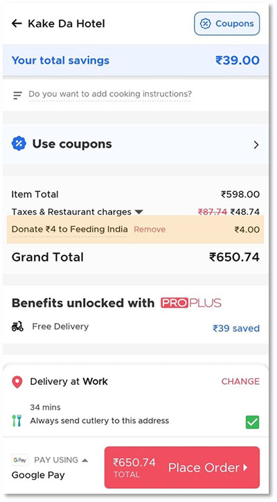
Sneak into Basket: Zomato tries to sneak in a Rs. 4 donation during Checkout unless the setting is changed. The cause seems just but let the users decide.
Interface interference
Manipulation of the user interface that privileges certain actions over others. We define interface interference as any manipulation of the user interface that privileges specific actions over others, thereby confusing the user or limiting discoverability of important action possibilities.

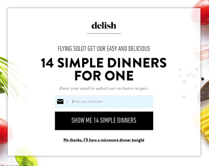
Toying With Emotion: Any use of language style, colour, or other similar elements to evoke an emotion in order to persuade the user into a particular action. The copy in this above example is trying to shame the user by suggesting that they would have microwave dinner if not for their offer.

Trick Questions: Appears to be one thing, but is actually another. The checkbox is to be checked if you do not want any communication from Virgin. However, the title is misleading and sneaks in a confirmation.
There are many more of these in the world today.
Therefore the takeaway
“Any short-term gains a company gets from a dark pattern are lost in the long term.”
— Hoa Loranger, NN Group
Build a product with a conscience & be a customer centered company with ethics that will ensure that your profits come from a long term relationship with your customer than a bad short term relationship. Invest in providing a better experience to the user, learn to persuade them to drive up the numbers.
References:
- Cover image by: Turgay Mutlay (https://dribbble.com/shots/3296851-Unsubscription-Trap)
- https://www.darkpatterns.org/
- https://darkpatterns.uxp2.com/
- https://uxplanet.org/5-common-ux-dark-patterns-and-user-friendly-alternatives-6c8c2f127242
- https://tsharon.medium.com/measuring-user-happiness-d00c941f5365


