
UX by the Minute
Parthhavi Mehta /
A long rainy day, an even longer cab ride and massive traffic was the origin story of the subject for this article.
It was a grey day, and water was pelting down in buckets as I was on my way home from office. The commute is usually an hour and a half on a good day, but that day it really felt like the clock had stopped ticking! The endless scrolling on Instagram didn’t help with the frustration, neither did browsing through Netflix or Spotify. And the long, endless line of stationary cars on the highway, certainly didn’t help either. I was almost convinced I had grown a few grey hair strands along the way!
But fun fact, I checked my Uber trip details and the total time taken was only 45 minutes! So why is it that even 45 minutes that day felt longer than 2 hours?
I’m sure at some point you have all experienced seconds feeling like hours, while you’re waiting for something. It could be while waiting in line at a grocery store, waiting for a website to load or even just waiting for the cash to come out quicker from an ATM kiosk.

In today’s fast-paced digital world, things are no different. We as users expect instant gratification for every interaction. Every click is a race against time and any delay can lead to frustration and dissatisfaction; be it waiting for your email to refresh, waiting for a Figma file to load before an important presentation, waiting for an online game to load or even waiting for a music playlist to buffer.
This impatience is probably heightened from a deeper, core-lying issue. Perhaps because we are all so used to constant content consumption, this restlessness translates into our daily lives even while merely waiting a few seconds amidst daily tasks. And as citizens of this digital universe, being part of a generation that is condemned by the doom scroll, I think we can all agree. I’m sure we all relate to numerous such instances that take place in our daily lives which can make even a 5-second delay seem like forever. However, when you come to think of it, the actual wait time may have very little to do with how long the wait feels.
Studies show that time spent by users while waiting for a product to respond or load significantly impacts their overall perception of that experience. Our perception of time is quite subjective and can vary greatly depending upon our emotional state and the kind of activities that we’re engaged in.
There’s a study by David Maister (a Harvard Business School professor, American writer and expert on Business Management practices), who was keen on understanding the intricacies of human patience and waiting. And through his dedicated research, distilled 8 fundamental principles that govern this universal experience. He came up with a tangible framework that sheds light on the psychological nuances of waiting and its impact on our daily lives:

Imagine being in a rush for a meeting, and you find yourself waiting impatiently for this:
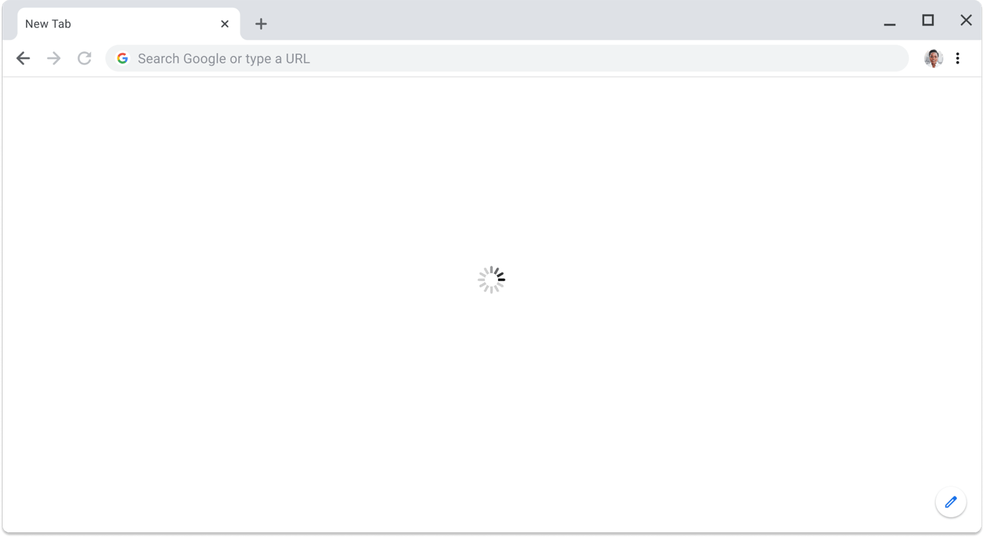
Many a time we see websites having pre-loaders on loop which just keep incessantly spinning. It doesn’t really denote the waiting time for the user neither does it show the progress achieved in terms of loading, which turns out to be a very frustrating practice for its users.
Now as UX designers, we’re constantly trying to think of our user’s and what would be beneficial for them but at the same time, designers can tend to overlook small things in the larger scheme of things.
This is when I realised that Maister’s framework is applicable even to me not just as a user but also as a User Experience designer.
So let’s see how some of the designers around the world have tried to harness this knowledge and solve this problem for their users, to enhance user satisfaction.
1. Gamification
Engagement through gamified interactions
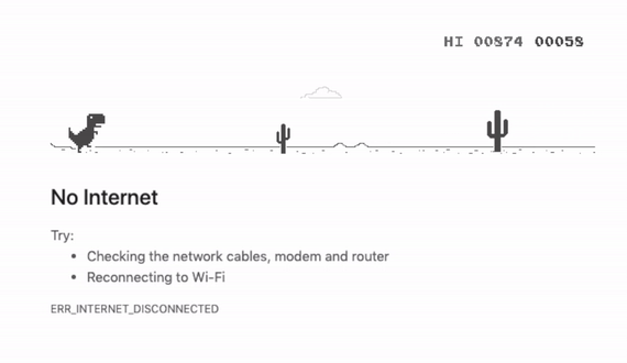
Chrome’s gamified loading was a stroke of genius among the crowd. Instead of presenting users with a dull error message, they offered a fun & interactive game featuring a pixelated T-rex. It’s simplicity and intuitiveness made it accessible to users of all age groups, hence enhancing the process of waiting by distracting their attention from the concurrent problem.
Maister’s principle ‘Unoccupied time feels longer than occupied time’ rings true in this case. From a psychological perspective, users who are actively engaged with content or tasks tend to underestimate time; whereas conversely, waiting for something in particular can make seconds feel like minutes. In essence, The ‘Chrome Dino’ was an example of clever and user-centric design. It demonstrated how simple gamification of a potentially frustrating experience can be transformed into a moment of light-hearted fun.
2. Edu-loading
Quick learning through pro-tips & fun facts


Duolingo takes an innovative approach by introducing bite-sized language lessons amidst their loading process. They teach new words in different languages or give out pro tips or facts that could help the user learn faster. While leveraging the loading time for productive learning aligns perfectly with Duolingo’s core mission of language education, it also ensures an intellectually stimulating and enriching overall experience for the users.
Along with confirming that occupied time can feel shorter than unoccupied time; this example also corroborates the principle that states ‘The more valuable the service, the longer the customer will wait’.
3. Progressive Loading
Patience through perceived control
The degree to which an individual believes that they have control over themselves and the activities within their surroundings is called ‘perceived control. This phenomenon allows users to feel they have some sense of control, resulting in a positive influence on their perception of time.
Providing visual feedback to user’s is a great way of keeping the user engaged, while reducing uncertainty and anxiety.
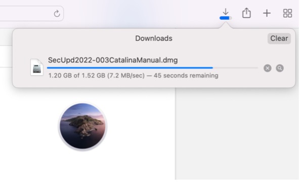
Safari does the job well in providing that positive reinforcement to its users. Showing the download data upfront reassures them of the remaining wait time which can help steer them away from dropping off.
Another example of the same but with a more visually appealing style is WeTransfer.

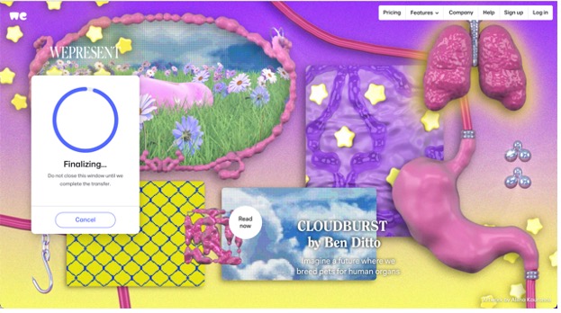
They too, have a very clear indication of the ongoing upload & estimated wait-time. It displays the percentage upfront and it’s micro-animation is eye-catchy without being intrusive. Besides this, the inclusion of informative messages or tips during this wait period keeps the user further engaged, providing reassurance and context.
What’s unique about WeTransfer is that they showcase new artwork and carefully curated design-related content with every visit.
The regular rotation of visuals not only captivates the user’s attention but also encourages exploration and discovery; and this is how they become more than just a file-sharing service!
This example too, like the others, validates that occupied time feels shorter versus unoccupied time. It also confirms that ‘Uncertain waits seem longer than known, finite waits’. When a user is aware of the estimated wait-time, it definitely has a favourable impact on their sentiments at that moment.
4. Gradual Loading
Moderated anticipation

Skeleton screens (or ‘loading placeholders’) are great in terms of giving visual cue’s to their users. They guide user’s attention towards the forthcoming content, allowing them to anticipate what’s coming next. This not only reduces abrupt jumps between screens but also creates smoother transitions. The more information provided to the users about the wait time and loading progress, the better it is.
According to a principle from the Maister framework, ‘Anxiety makes waits seem longer’. Introducing skeleton screens could be a great way of fostering some sense of control within the users. The swift movement of placeholder boxes transforming into the real content of the page makes you perceive the product to be faster than it actually is. This in turn contributes in a reduced perceived wait-time and reduced anxiety.
Skeleton screens have become quite popular and are also commonly used by a lot of media platforms such as Meta, X (formerly Twitter), Reddit, YouTube, LinkedIn etc.
5. Micro-animations
Delight through dynamic pre-loaders

As Maister correctly stated, “Pre-process waits feel longer than in-process waits.”
This could easily be applicable to a user – especially a famished one – as they log onto a food app, to tiresomely browse through a plethora of restaurants and menus, trying to decide what to eat before placing their meal order.
Incorporating quirky illustrations & fun animations in your loaders can be a great tactic to hold the user’s attention. This not only adds an element of surprise but also provides some form of respite. It serves as an immediate point of visual interest and helps set the tone for the user’s entire browsing experience.
The McDonald’s website runs its ‘Fries Pre-loader’ inspired by one of their iconic products. It displays a playful animation featuring their world-famous golden fries while the page content loads in the background.
Doing so imparts a memorable touch to the McDonald’s online presence and at the same time also fosters a sense of connection between the brand & its online visitors.
Conclusion
To sum things up, the perception of time in user experience is a critical aspect often underestimated. The experience of waiting – whether in the physical world or the digital realm – where instant gratification is the norm, can get frustrating.
As designers, we play a crucial role in mitigating user frustration during wait times. If we fail to retain the user’s attention on the screen, they are likely to abandon the app which leads to an increase in drop-off rates. Our role as UX designers is not just to design screens; it is to understand our user’s, their behaviour and create designs accordingly.
By implementing strategies that align with the principles outlined by David Maister, we can design experiences that can further enhance the user satisfaction. As, this design philosophy would not only bridge the gap between anticipation and delivery but also contribute to a changed perception of time. It would serve as a testament to the power of thoughtful design, which in turn would solve not just the functional problems but also cater to the emotional and psychological needs of the users.
All this being said, our fundamental objective as designers should primarily be to try and reduce the loading time altogether. The aim should still be to figure out ways alongside the development team on how to achieve minimum wait time for any kind of loading. Implementing basic strategies such as – converting images to SVGs, compressing them in various formats to reduce file size, efficient coding practices should do the trick. However, despite the above hacks, if minimal loading time is unattainable then the next best thing would be to shift focus and ensure the users are at least engaged while they wait. In a world of UX where every minute counts, it is our duty to ensure each one is well spent.
References
- https://davidmaister.com/articles/the-psychology-of-waiting-lines/
- https://www.reddit.com/media?url=https%3A%2F%2Fi.redd.it%2F7mdkp9ig7hk61.jpg
- https://www.reddit.com/media?url=https%3A%2F%2Fi.redd.it%2Fexcessively-long-loading-time-v0-evu33brzi9w91.jpg%3Fs%3Df1954fba13e9f3adf3937bf839425938e44ebec6s
- https://uxplanet.org/what-do-we-know-wrong-about-using-loading-in-apps-69c7d2544989
- https://makeameme.org/meme/just-waiting-for-5bc08db83f